
Snow Water Equivalent (SWE) Analysis
The SWE Analysis section provides detailed insights into snowpack conditions across elevation bands, helping you understand how much water is stored in the snowpack and how it compares to historical patterns. Snow Water Equivalent (SWE) represents the amount of water contained in the snow.
Because snowpack varies significantly with elevation, this analysis breaks SWE down by elevation band. This helps reveal insights such as where water is currently stored in the basin, how snowpack at different elevations compares to the historical average, and what that may mean for runoff timing and water availability as you plan.
Note: this analysis is powered by SWANN (Snow Water Artificial Neural Network) data and is currently available for U.S. locations only. SWANN is a daily, 4 km gridded record of SWE and snow depth created by blending long-term in-situ measurements from SNOTEL and COOP stations with PRISM climate data using an artificial neural network to ensure high historical consistency. For more information check out the source metadata page or you can also view the data directly here.
How to access SWE analysis
You can run SWE analysis directly from any forecast page:
- Navigate to a forecast in the HydroForecast dashboard
- Scroll to the bottom of the page
- Click “Run SWE Analysis”
 Overview of the SWE charts
 Overview of the SWE charts
The SWE Analysis includes three complementary views, each designed to answer a different question about the snowpack.
SWE Volume by Elevation Band — 45 years
This chart shows how current SWE compares to 45 years of historical data for each elevation band.
How to read it:
- Each box represents the typical range of SWE at that elevation
- The line inside the box is the historical median
- The red diamond shows the current year
What it helps you understand:
- Whether current conditions are typical, above, or below normal
- Which elevation bands are driving differences this year

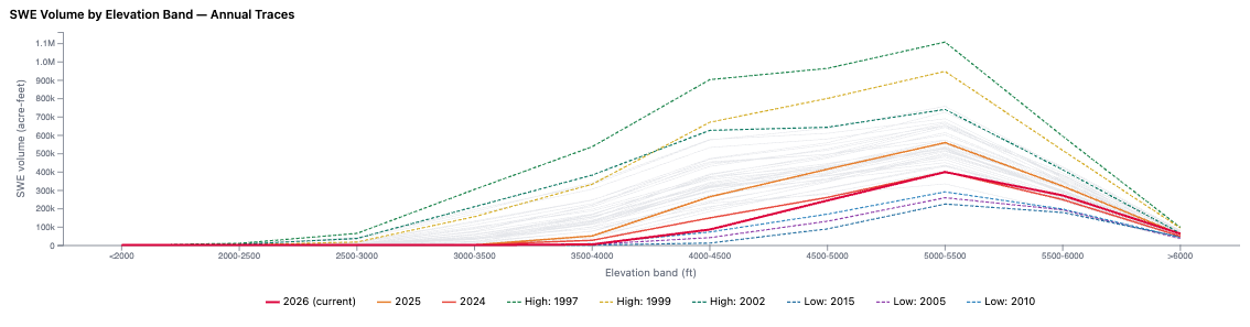
SWE Volume by Elevation Band — Annual Traces
This chart compares the current year to selected historical years, including notable high and low snowpack seasons.
How to read it:
- Each line represents a different year
- The current year is highlighted in red
- Other lines show past high and low scenarios,
- Hover over the year in the legend to highlight that year in the chart
What it helps you understand:
- How this year compares to extreme or representative past conditions
- Whether current snowpack resembles a known “wet” or “dry” year
 SWE by Elevation Band — % of Normal
 SWE by Elevation Band — % of Normal
This chart shows how current SWE compares to the historical average at each elevation band.
How to read it:
- Bars represent SWE volume by elevation
- Comparison between current year in red vs. historical average in green outline
- Hover over the red bar in the chart to see % of normal for that elevation band in particular
What it helps you understand:
- Where snowpack is above or below average
- Which elevation bands are contributing most to overall conditions
- The overall snowpack status (e.g., 107% of normal)
